with your project

In an era where children are immersed in the digital realm, the significance of crafting web designs tailored to their needs and preferences cannot be overstated. Designing websites that cater to kids goes beyond mere aesthetics; it involves creating an environment that fosters curiosity, safety, and enjoyable online interactions. This guide delves into essential principles and strategies every designer should employ when developing web experiences for young audiences.
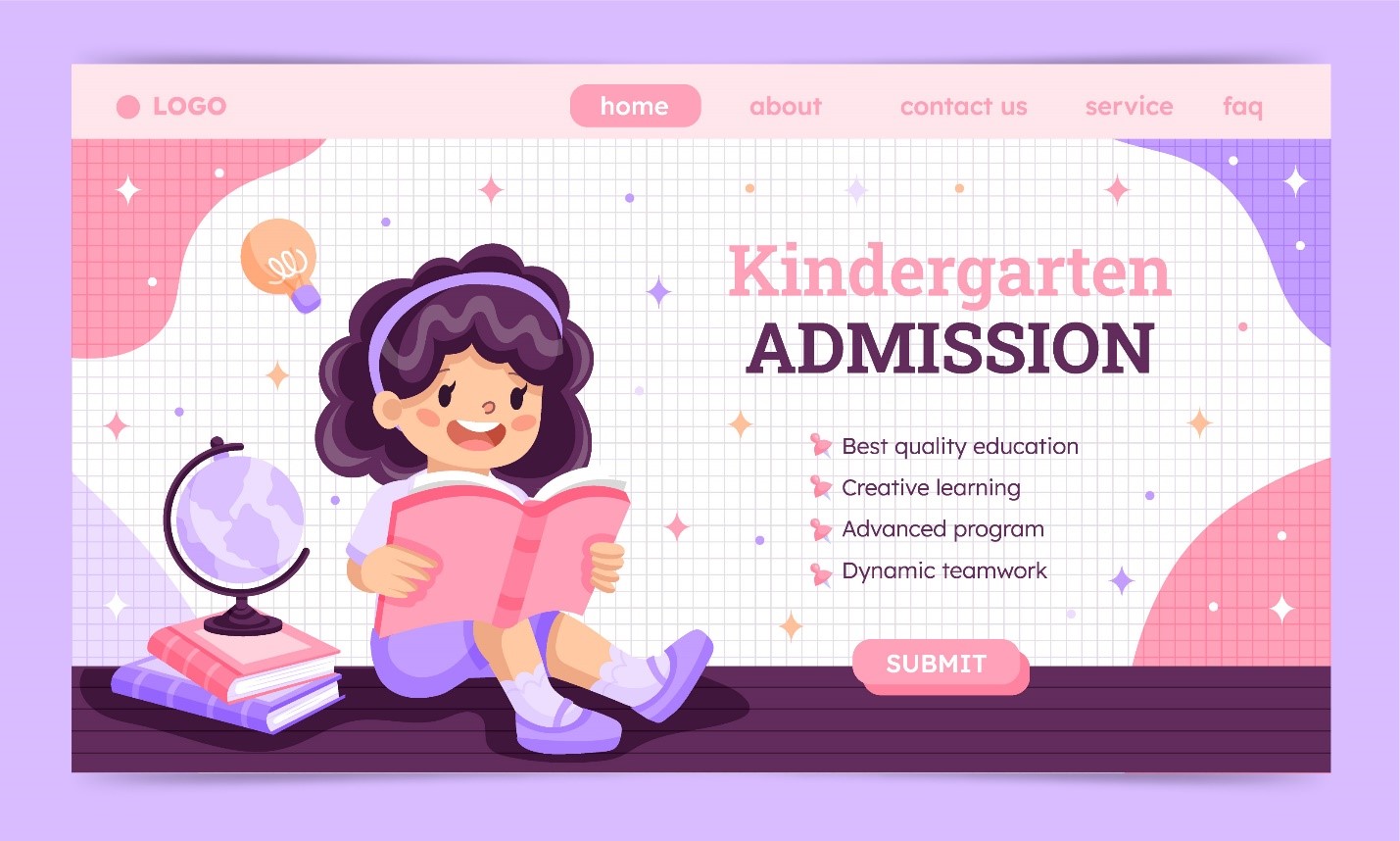
Color is a potent tool in web design, particularly when engaging children. Vibrant colors can spark excitement and curiosity, while softer tones establish a friendly and welcoming ambiance. Opting for a limited color palette prevents overwhelming young users. Selecting colors that align with the website's subject matter is crucial, whether it's an educational platform or an entertainment hub.
The role of imagery in crafting captivating experiences for kids cannot be understated. Integrating whimsical illustrations, relatable characters, and age-appropriate visuals can deeply resonate with their interests. Custom illustrations lend a distinct personality to the website, differentiating it from generic designs. These visuals should not only be visually appealing but also serve as intuitive guides through the website's content.
Simplicity in design doesn't equate to sacrificing functionality. Kid-friendly websites should exhibit a straightforward navigation structure that empowers young users to explore effortlessly. Utilize large, recognizable buttons and icons that don't demand advanced reading skills. Clear labels and intuitive icons enable children to navigate autonomously, enhancing their confidence and sense of achievement.
Interactivity lies at the core of engaging web design for children. Incorporating interactive features like quizzes, games, and animations encourages active participation and learning. Ensuring these elements are touch-responsive is essential, given that many children access websites through touch-enabled devices. Cross-device responsiveness is critical, accommodating users who switch between desktops, tablets, and smartphones.
When developing content, adopt a language that resonates with the target age group. Steer clear of jargon and complex terminology, opting for straightforward, relatable language instead. Integrating stories, anecdotes, and relatable scenarios establishes a personal connection with young users. Don't hesitate to infuse humor—children appreciate entertainment alongside education.
Child safety holds the utmost importance in the digital realm. Stringent privacy standards and regulations must be adhered to, safeguarding children's personal information. If the website involves user-generated content or interactive features, robust moderation, and parental control mechanisms should be in place to prevent the display of inappropriate content.
Designing web design experiences for children necessitates a blend of creativity, empathy, and technical proficiency. By embracing vivid colors, relatable imagery, interactive components, and age-appropriate content, designers can establish online spaces that captivate, educate, and amuse young audiences. Remember, a well-crafted kid-friendly website transcends the realm of code and pixels—it ignites the spark of curiosity and exploration in the upcoming generation.
Whether you're creating an educational portal, a storytelling application, or a digital playground, prioritize the needs and sensitivities of young users in your design process. Through this approach, you'll not only shape delightful digital journeys but also nurture a positive relationship between children and the virtual world.