with your project

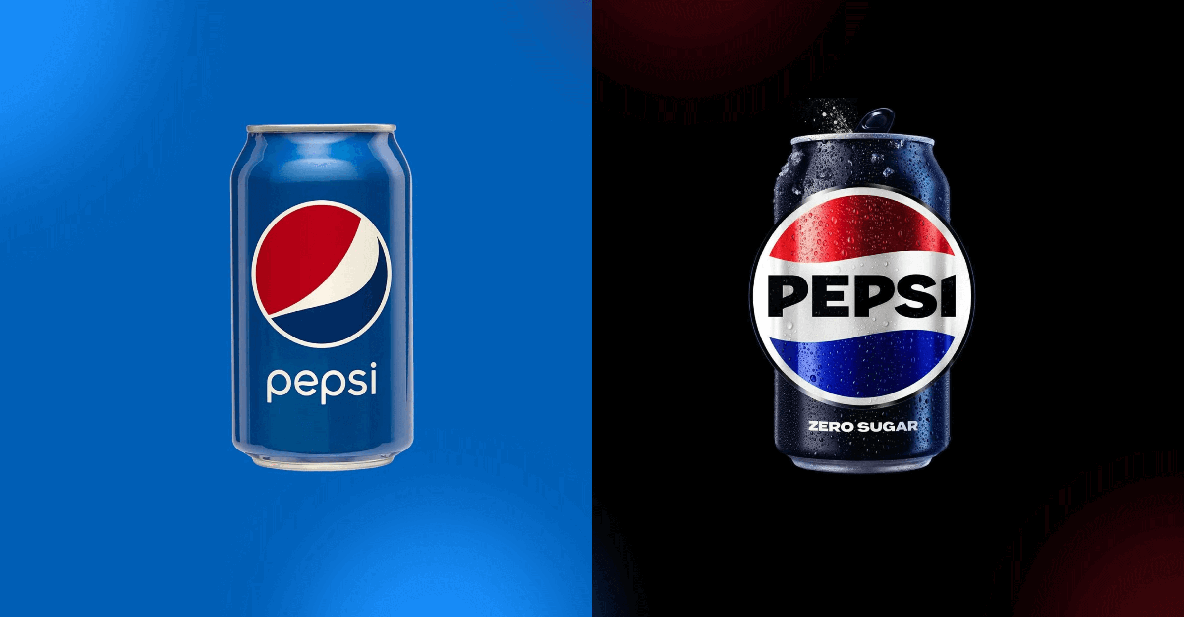
The redesigned color scheme, bold text, distinctive pulse, and black highlight the brand's dedication to Pepsi Zero Sugar in the new design. Beginning this fall, Pepsi will launch the new look across all brand touchpoints to commemorate the company's 125th anniversary.
The legendary global brand Pepsi has updated its distinctive globe logo for the first time in 14 years with a new logo and visual identity system Pepsi will introduce the new design globally in 2024, ushering in the company's new era, after launching it in North America this fall in preparation for the brand's 125th anniversary. All physical and digital touchpoints, including packaging, fountain and cooler equipment, fleet, fashion, and dining, will have the new design, which evolves the Pepsi brand to highlight its most unrestrained and fun attributes. Pepsi is essential to fulfilling PepsiCo Positive's sustainable packaging goals, and as of 2022, Pepsi will start converting all 20-ounce bottles of its products, including Pepsi Zero Sugar, to 100% recycled PET in the United States. While making a significant step toward the future, the new logo and graphic identity pay homage to the brand's rich history.
Pepsi has been a daring challenger throughout its illustrious history and has a close connection to pop culture. Pepsi has always advanced its culture to deliver one-of-a-kind fan experiences promptly, while simultaneously remaining legendary and timeless. Examples include reinventing the Super Bowl Halftime Show and the Pepsi Challenge, as well as generating some of the most famous commercials ever starring the most well-known actors and musicians in the world. Pepsi also consistently reimagines itself through bold marketing and product innovation. This includes developing its television programs, exploring Web3, and launching enticing new flavors over the years, such as the recent Nitro Pepsi, Pepsi x Peeps, Pepsi for SodaStream, and an improved Pepsi Zero Sugar taste in the United States to give consumers the best-tasting cola in the zero-sugar category.
Pepsi's main motivation is to empower consumers to select more moments of unbridled happiness. The refreshed and distinctive design gives the visual system movement and animation, giving Pepsi more freedom to move between physical and digital locations, from store shelves to the metaverse, in an increasingly digital world. Additionally, it enables more fluid and imaginative engagement with partners and merchants as well as greater adaptability in engaging people where they live, work, play, and shop.
Since it has been a mainstay in pop culture and challenged the category for the past 125 years, Pepsi is an iconic brand that is always developing, according to Todd Kaplan, Chief Marketing Officer of Pepsi. We couldn't be more thrilled to bring in a new era for Pepsi since this exciting new and contemporary look will encourage brand distinction to emerge bigger and bolder and assist customers in discovering new ways to openly appreciate the things they love. This new visual system highlights the Pepsi brand's illustrious history while also making substantial strides to position it for success in an increasingly digital environment.
In order to create a style that is shamelessly modern and unmistakably Pepsi, the logo and visual identity consciously draw inspiration from the brand's 125-year heritage while also incorporating contemporary aspects. Important design components are:
1. Heritage Homage: The new logo pays tribute to Pepsi's storied past by subtly incorporating iconic elements from its history, ensuring a sense of familiarity and nostalgia for loyal fans while evoking a sense of legacy.
2. Modern Minimalism: While drawing from its heritage, the logo embraces a minimalist design philosophy that resonates with current design trends. This clean and uncluttered approach enhances legibility and adaptability across various platforms.
3. Dynamic Color Palette: The color scheme strikes a harmonious balance between the brand's classic shades and contemporary hues, creating a visual symphony that captures attention and conveys Pepsi's evolution.
4. Sleek Typography: The typography showcases a sleek and contemporary font that exudes confidence and relevance. This choice not only enhances readability but also mirrors Pepsi's progressive outlook.
5. Elevated Simplicity: The logo's simplified elements work together harmoniously, conveying a sense of refined simplicity that effortlessly conveys the essence of the brand while projecting a modern image.
6. Iconic Symbolism: The logo may introduce new symbolic elements that reflect Pepsi's commitment to innovation, unity, or sustainability, infusing deeper meaning and resonance into the brand's visual representation.
The decision to redesign a logo as iconic as Pepsi's can be driven by a combination of strategic, creative, and market-related factors. Here are some potential reasons for the redesign of the Pepsi logo:
Brand Modernization: Over time, brands often seek to update their visual identity to reflect changing consumer tastes and design trends. A logo redesign allows Pepsi to maintain its relevance in a fast-paced and dynamic market by presenting a more modern and contemporary image.
Anniversary or Milestone: Significant milestones, like Pepsi's 125th anniversary in the example you provided, can serve as opportunities to refresh a brand's identity. A redesigned logo can symbolize both the brand's rich history and its forward-looking aspirations.
Adapting to Cultural Shifts: Societal and cultural changes can impact how a brand is perceived. A logo redesign might be prompted by a desire to align the brand with evolving cultural values, social trends, or consumer expectations.
Competitive Landscape: The logo redesign could be a strategic move to stand out in a competitive marketplace. By modernizing its logo, Pepsi may aim to differentiate itself from competitors and capture the attention of new generations of consumers.
Global Consistency: In an increasingly globalized world, brands often seek a logo that translates well across different cultures and languages. A redesigned logo can ensure that Pepsi's visual identity remains consistent and recognizable worldwide.